Templates
General concept
For some pages, the template is customizable, meaning that fields display and behavior can be set by configuration:
- Inbound orders
- Outbound orders
- Bookings
- Shipments
Templates will impact the detailed view of the element, including:
- View mode: the view when landing to the page
- Create mode: the form generated when clicking Create button
- Edit mode: the form generated when clicking Edit button
Templates can be defined by Hubble key users and will be used to dynamically build the page or form:
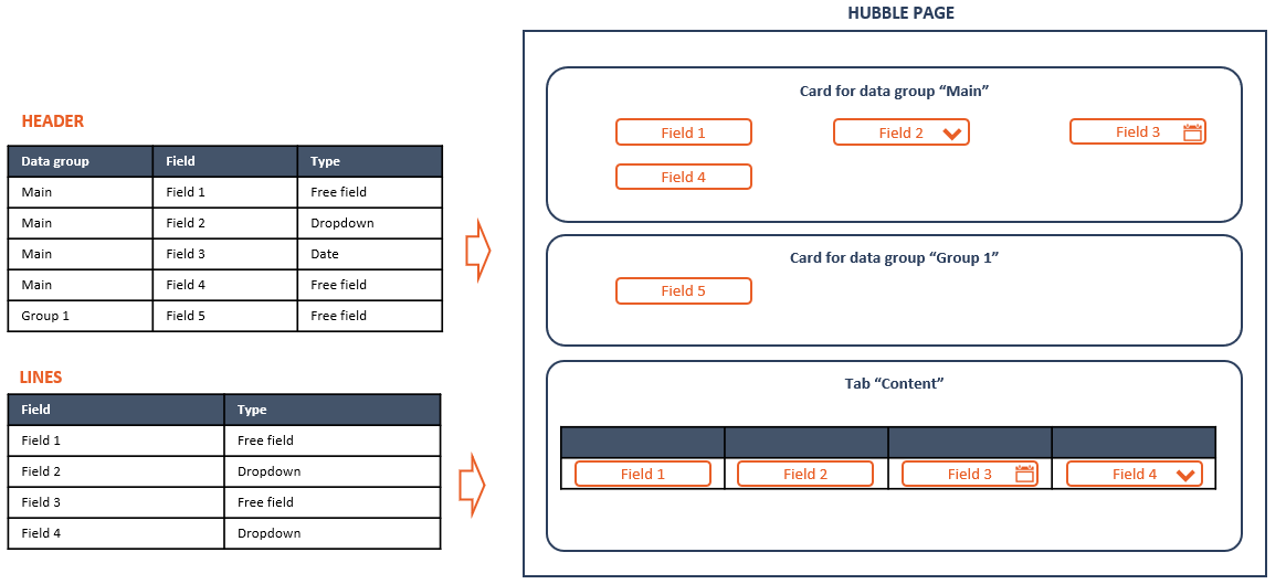
Templates helps to control whether a field is:
- Part of the template (View + Create + Edit): if not, the field will not be displayed at all
- Display only (Create + Edit): if enabled, the field can't be modified
- Mandatory (Create + Edit): input a value is mandatory
- Subject to validation (Create + Edit):
- have custom constraint on min and max length (for text)
- greater than 0 (for numbers)
- must exist in Master Data
- Pre-filled with a value (Create): have a custom default value
Configure templates
Templates list
Templates can be accessed through the menu Templates in SETTINGS section:
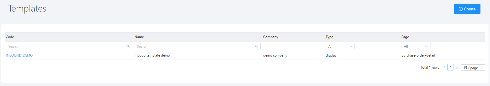
Click on a template to view the template's detail
Page Layout
Outbound order page is organized in 2 cards:
- Template general information
- Tabs, for template definition:
- Header fields: list of fields that will be displayed for the entity header, in different cards
- Line fields: list of fields that will be displayed for the entity lines, in tab "Content"
- Page code: page template described in Hubble specific structured format (JSON)
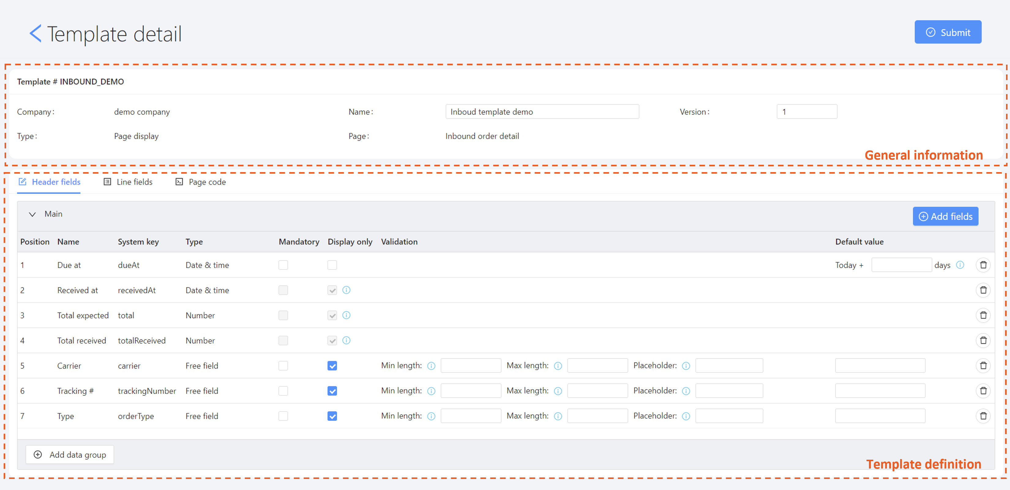
Template general information
Template general information is composed of:
- Code: unique code for that template
- Company: on which company the template will be applied
- Template name: used to described the template
- Version: unused
- Type:: currently, only Page display is available
- Page:: on which page the template will be applied
Template definition
Manage fields list
The way to manage fields list is the same for header or lines
Add fields
To add fields to the template, click on the "Add fields" button

The below pop-up will appear:
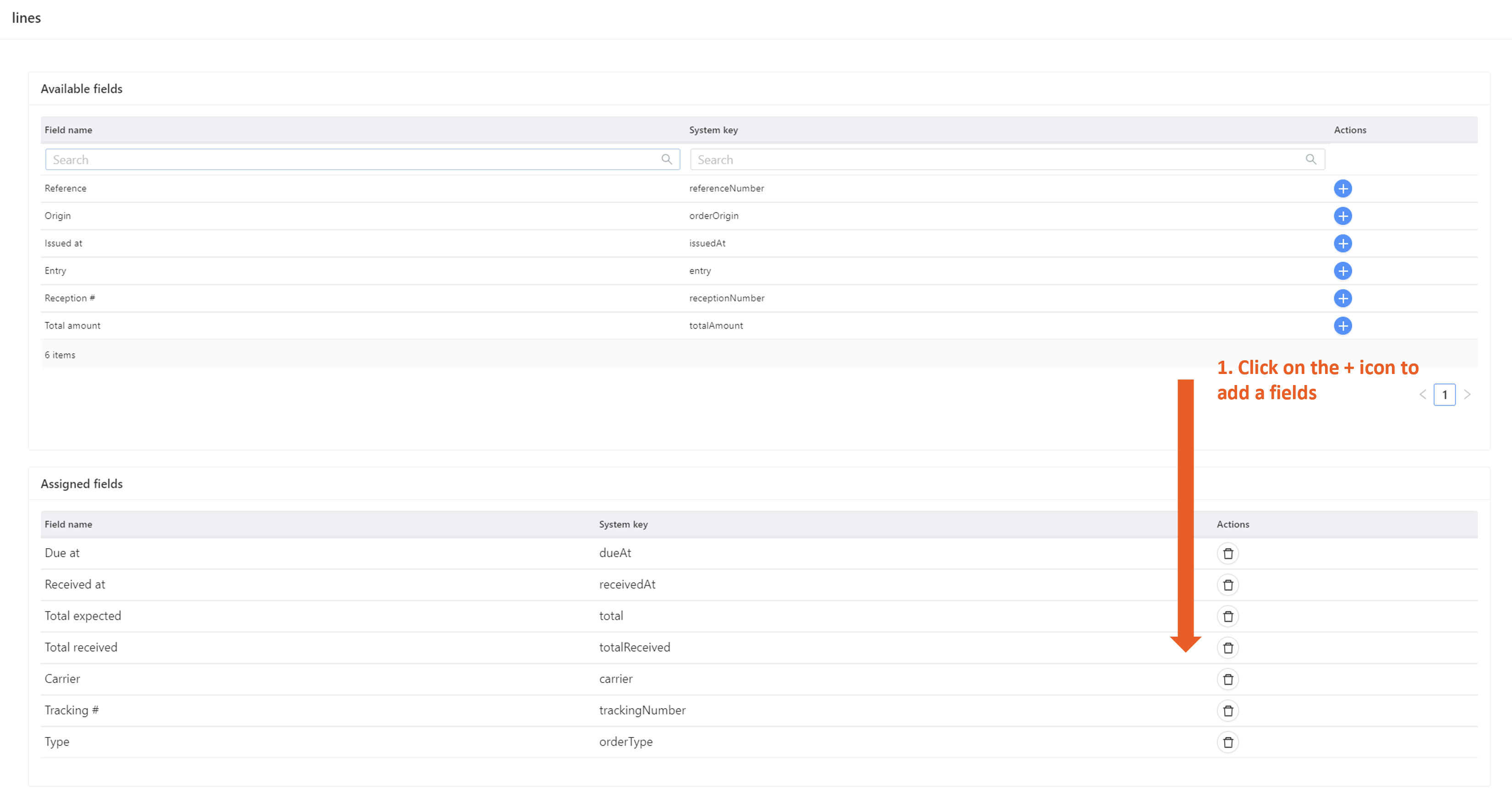
- On the top table, all fields available on this page will be listed.
- On the bottom table, all fields already selected are listed.
Click on the "+" icon to add a field: the row will be moved from the top table to the bottom table. Then click Assign to validate when all fields are properly selected.
Remove fields
Click on the bin icon to remove a field. 
Change fields sequence
Drag and drop fields within the table to rearrange display sequence:
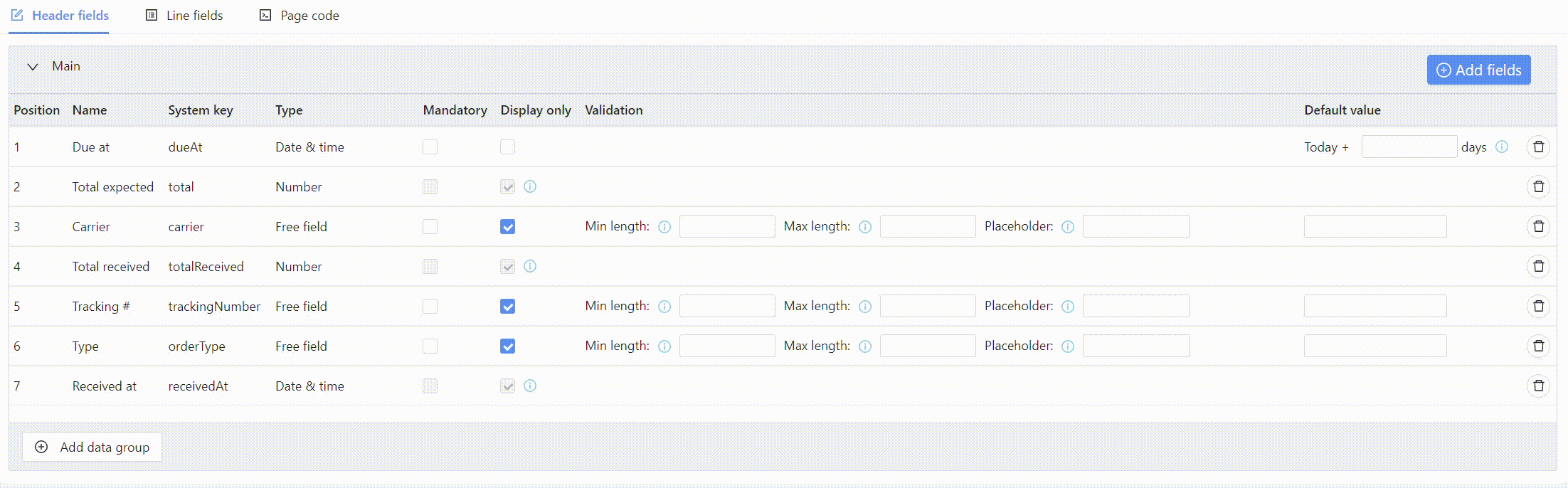
Configure fields
The way to manage fields configuration is the same for header or lines
Field types
Fields types are predefined in Hubble, and cannot be changed by users, except for attributes.
Field type will determine how the field will be displayed in creation or edit forms:
| Field types | Description | Display |
|---|---|---|
| Free field | Most common input type: free input field |  |
| Free comment | Comment style field: possibility to input several lines |  |
| Date | Date picker | 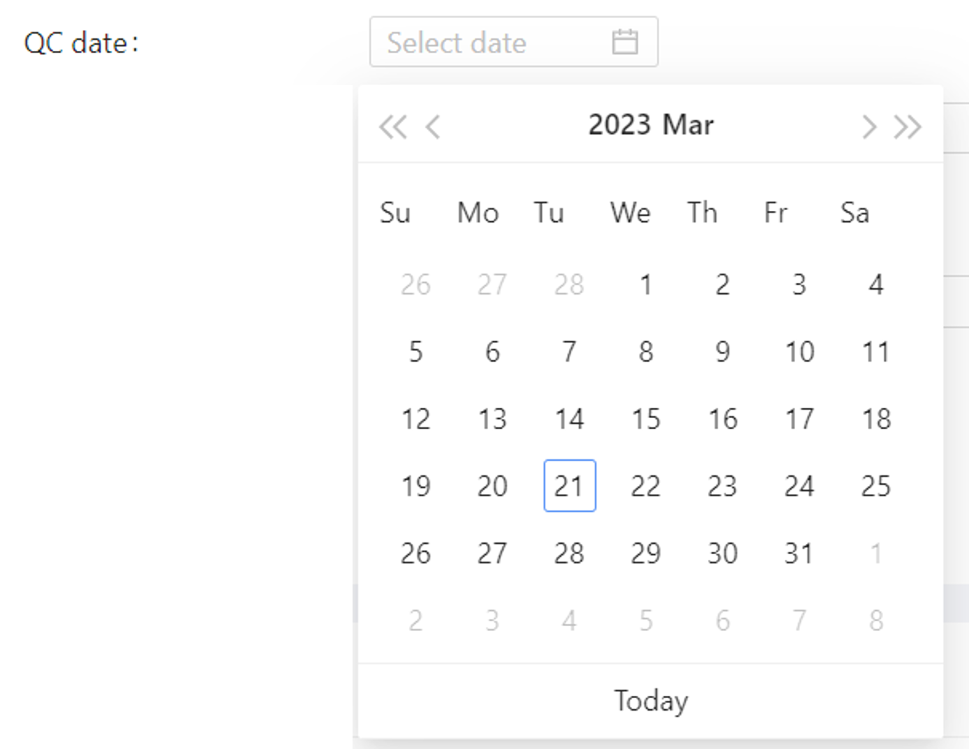 |
| Dropdown | Entry is constrained to a limited number of values | 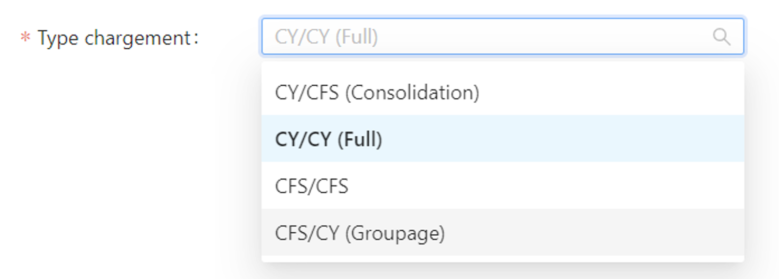 |
| Number | Input integer only (for quantities) |  |
| Amount | Input float only (for weight, volumes, amounts, ...) |  |
| Checkbox | Yes/no input |  |
| Connection | Simple connection selector | 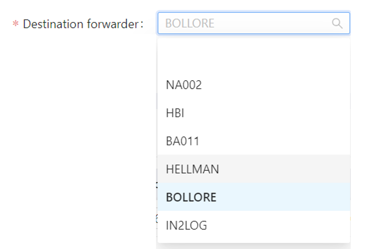 |
| Status | Entity status | 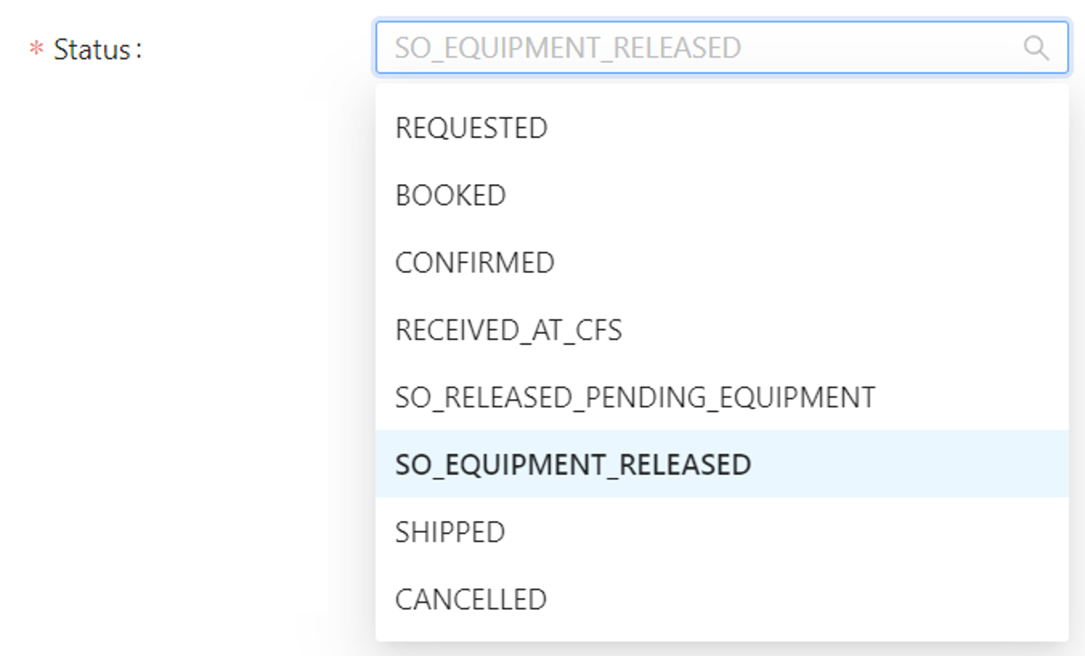 |
Field definition
Fields behavior can be defined on each row:

- Mandatory: control if the input of data is mandatory or not
- Display only: if ticked, the input can't be modified
- Validation: for some fields, an additional validation can be configured
- For free fields:
- Minimum length: minimum number of characters to input
- Maximum length: maximum number of characters to input (tip: set min and max with same value to control the exact length of the input)
- Placeholder: tip for end user about how to input data (soft validation)
- For fields linked to master data:
- Master data validation: define if the data has to pre-exists or if it could be created on-the-fly
- For number or amounts:
- Greater than zero: define if 0 is acceptable value or not
- For drop downs:
- Reference category: reference code category used to get list of limited values (editable only for attributes)
- For free fields:
- Default value: when creating data, force a default value to facilitate or fasten data input
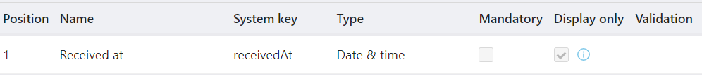
Some fields are grayed, meaning that it's not possible to modify its definition, and they are forced as "display only". These fields are updated by Hubble logics only.
For example, "Received at" on Inbound Order is automatically updated with the date and time of reception when the order is received. User can't modify that date and time manually.
Data groups
Data groups are only used for headers. It helps to organize data in separated cards (or blocks) so that it's easier for end user to read the page and retrieve data.
This feature is specially useful if you have lot of fields displayed (more than 12, which is 4 rows of fields in 1 single card).
For example, you can:
- assign general order fields to the Main data group, such as order reference number,
- create a specific data group with title "Totals", with total ordered, total shipped, total amount, ...
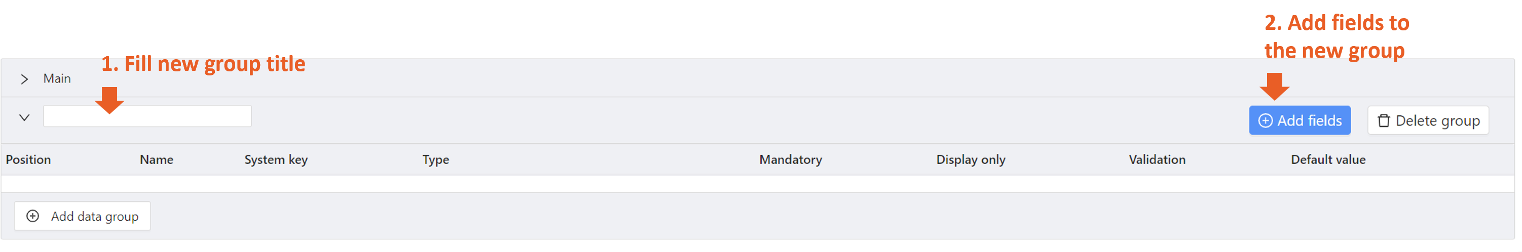
To create a new Data group, click "Add data group" in the bottom of the page:

Then fill the new group with its template definition:
A data group will be represented as a separated card in the final page, with its own title.
The Main data group is always pre-created, and it can't be deleted. The main data group will be always the top card of the screen, and the card's header will display main information such as main number, status, tags, creation and modification dates.