Navigation
The current documentation provides main navigation principles in Hubble for new users.
Window layout
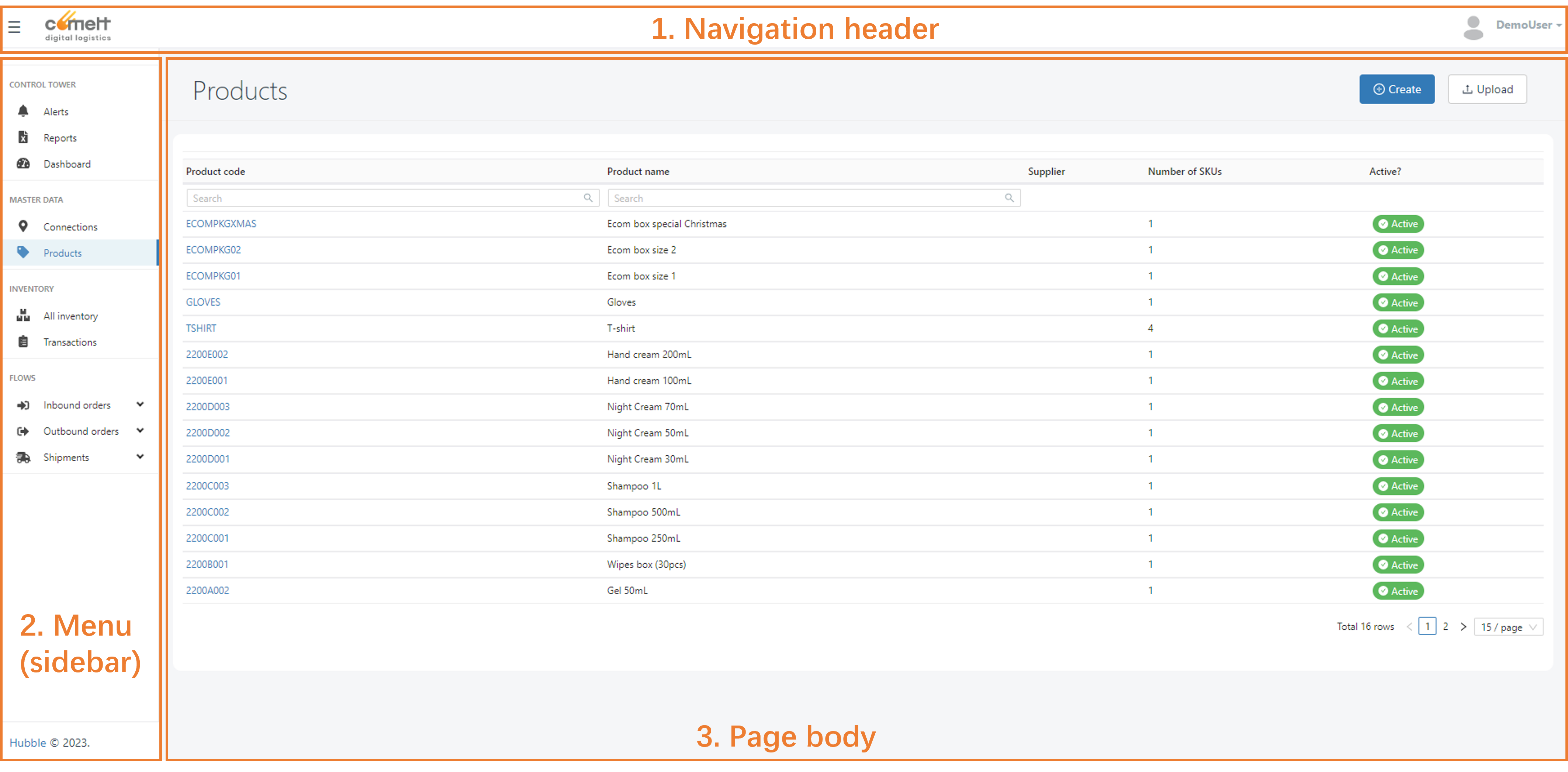
In Hubble, the window layout is composed of 3 main parts:
- A navigation header, that helps the user to change main view parameters
- A menu in the sidebar, to helps the user to navigate between different pages
- A page body, where the user can interact with Hubble data
Navigation elements
Navigation header
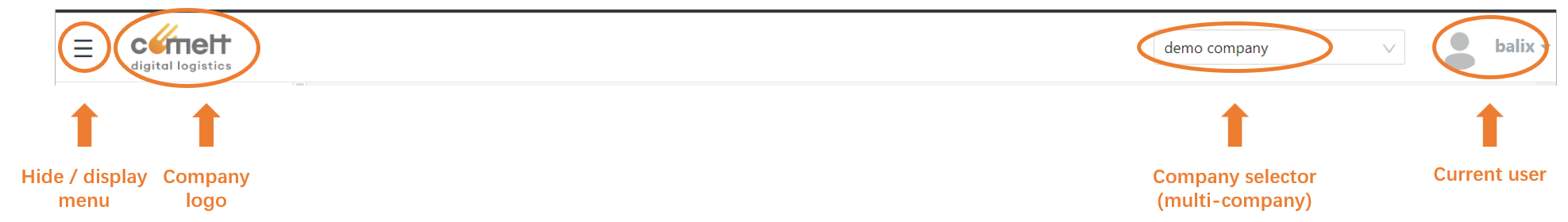
The navigation header has, from left to right:
- A menu icon, to hide or display the menu
- A company logo, if set in company parameters
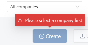
- A company selector, if the user has access to several companies. If no, the corresponding space remains blank. The company selector helps the user to place himself within that company, meaning viewing data only for such company, and create/upload data for that company.caution
If the user has access to the company selector, it is possible to view the data for All companies at the same time. However, creation and uploads will be disabled: the user must select a company before create or upload data.

- Current user's profile, with a drop down from where the user can:
- Access to its Preferences (see User preferences)
- Logout from Hubble
Menu (sidebar)
The user can access the different features in Hubble including:
- Analytics: access to Reports, Alerts, Dashboards. Access to these features will depend on user's Subscription plan.
- Master data: Connections, Products, SKUs
- Inventory: Stock view, Transactions, ...
- Flows: Orders and Shipments
- Settings: (for admin users only): manage and create Companies, Users, Templates, Reference Codes, ...
- Technical: (for technical users only): view information
The menu will vary according to the user access level: its roles and its subscription plan. Custom menus with hidden features or different hierarchy can be set for a given company: please contact your system administrator to deploy such feature.
Page body
There are 2 main views available in Hubble: list views and detailed views. Some pages might use different layout: such views are described in their own sections.
List views
In most cases, when navigating to a menu item, you will land to a page listing the elements available in Hubble in a form of an array. For example, for the list of Products:
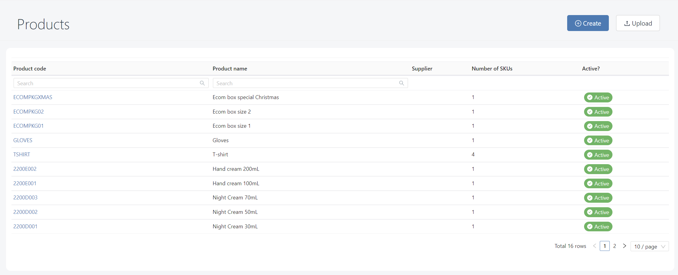
You can access detailed view by clicking on data hyperlinks
The below features can be accessed from such views:
Pagination
If there are too many items to display in one page, the data will be split in different pages:
You can navigate through pages with the page navigator below the array:

Change the page size (number of items displayed per page). Default will depend on the screen resolution, generally it's 10 or 15 per page.

The data will ordered from the most recent to the oldest: therefore the first page will displayed the 10 or 15 most recent elements.
Filters
You can use filters to filter out the data
- When some filters are applied, the filter icon will be displayed

- You can clear all active filters by clicking on this button
- The number of active filters will be displayed (example, here 2 filters are active)
- Filters are remanent: when you leave the page, and then back to the same page, filters will be saved
Quick access to details
In some pages, you can access quickly to more details by clicking on the plus icon. 
It will expand the row and provide more information, generally the content of the element (order lines, shipping unit lines, ...)
Extract to Excel
You can extract data to Excel by clicking on the Excel icon.
The Excel extraction will apply the filters that are active, therefore all data displayed will be extracted in the file without limit of pages.
Actions
Some actions button are displayed if you have at least the role USER. For most of pages, this buttons are:
- Create: create a new data through a form
- Upload: create new data massively by Excel upload
Detailed views
Detailed view displays data for a given element (ex: a specific order, SKU, ...).
It is possible to go back to the previous page by clicking on the top arrow:
Most of detailed views in Hubble are customizable. Contact your system administrator to customize the view.
Most views are organized as below:
- A top card, displaying general information of the element:
- In the upper left, the main reference number (ex: order number), which is unique
- In the upper right, creation and modification date and time

- In the card body, general information (ex: suggested carrier for an order)
- A bottom card, displaying detailed information in form of arrays
- Several tabs could be available
- The landing tab is linked to the content of that element (ex: order lines)
- Other tabs could be: list of documents, events, other view on the content, ...
- Some action buttons:
- Edit (then when editing, Cancel or Submit): if the user has role USER
- More actions: if the user has role WAREHOUSE, he can perform more actions such as cancelling an order, receive/ship, print label, ...
Create/edit forms
When using create or edit button, a form with the same template than detailed view will be displayed.
A button Submit will appear in the top right in order to submit your data creation or update
If the form input is valid, a symbol will be displayed at the left side of the button:

If the form input is not valid, there will be no icon on the button:

If the form is not valid, and you click on the button, all invalid inputs will be highlighted in red, for example, input required, values that should be greater than zero, ...

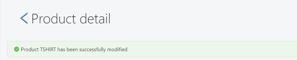
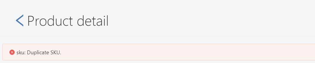
After submit, a banner will appear on the top to confirm whether the data has been successfully created/modified or not:
- Success message: if the data is successfully created/modified, the below message would be displayed:
- Error message: a red banner will be displayed on top if the data could not be created/modified (please contact your system admin if the message is not explicit):
- Success message: if the data is successfully created/modified, the below message would be displayed: